WeFlourish
Collaborators: Peter Ogden, Justine Lilgert
Roles
- Project Manager
- User Researcher
- Wireframer
- Usability Tester
Tools
- Axure
- InDesign
- Photoshop
- Illustrator
Methods
- User Interviews
- Design Studio
- Agile
- Usability Testing
Problem: The American Horticultural Society wants to get young adults ages 18-35 involved in their Master Gardener programs, by raising awareness of the Master Gardener programs through a gardening-oriented lifestyle app.
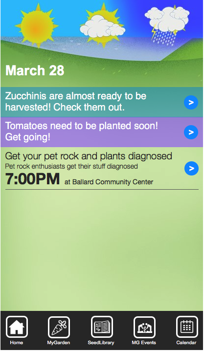
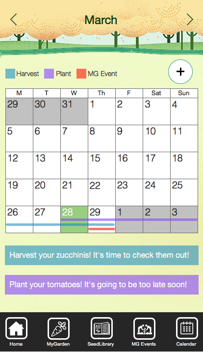
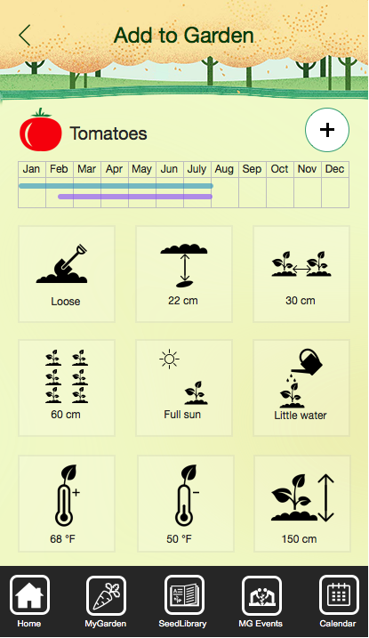
Solution: Create an app that focuses on the "now". What gardeners can do today for their garden, showing any events that they can attend and anything they can do for their garden. Emphasizing the ability to take action on your garden on a daily basis as opposed to stringent planning.
Takeaways: Consistency is key across the board. Having a playful feel, and then switching to real life images for certain pages is jarring. All whitespace doesn't need to be used, and keeping the user's knowledge of colors and patterns is important.
Research
My team didn't know very much about gardening or master gardeners, so we took to the internet to get more information about the community and about different aspects of gardening. We e-mailed several universities and contacted several master gardeners to interview them. We also wanted to understand the basic home gardener's needs and typical behaviours, so we created screener and interview script to get more information about home gardeners. We used this data to create a persona hypothesis.
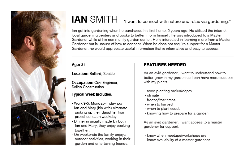
Our data showed us that master gardeners were typically older people who interacted with the community through holding workshops or events. They also typically preferred seeing plants in person, since they couldn't always accurately identify or diagnose plants through pictures. Our home gardener research also showed that many gardeners were 9-5 professionals. They also tended to view gardening as an escape from reality and the grind, preferring to do so with their family. They also enjoyed harvesting and planting their vegetables.
Preliminary Designs
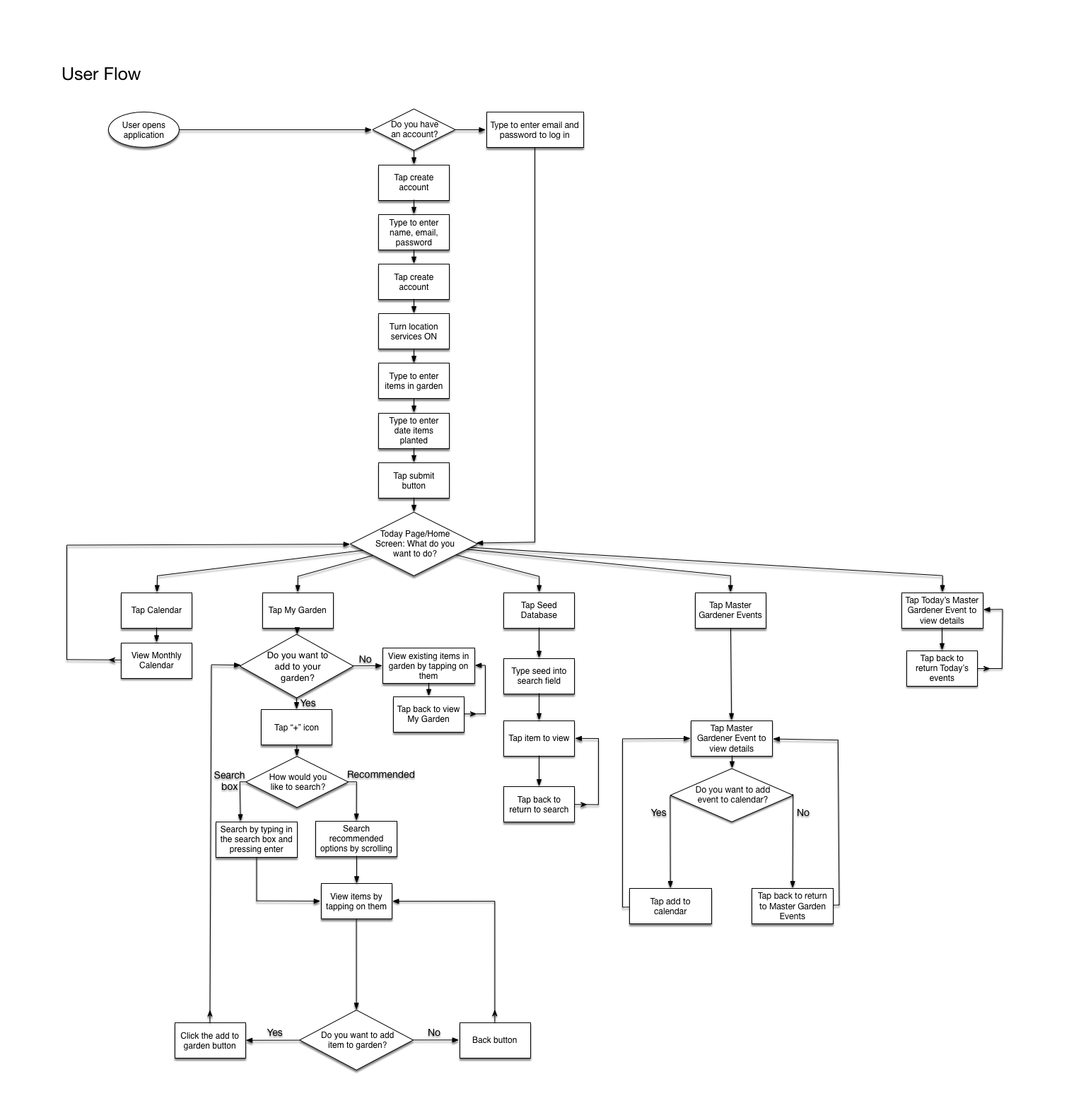
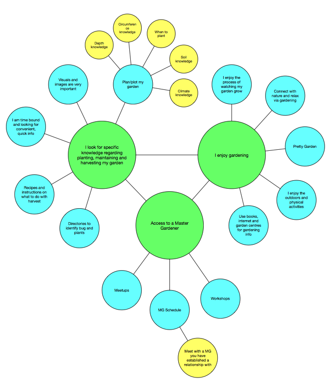
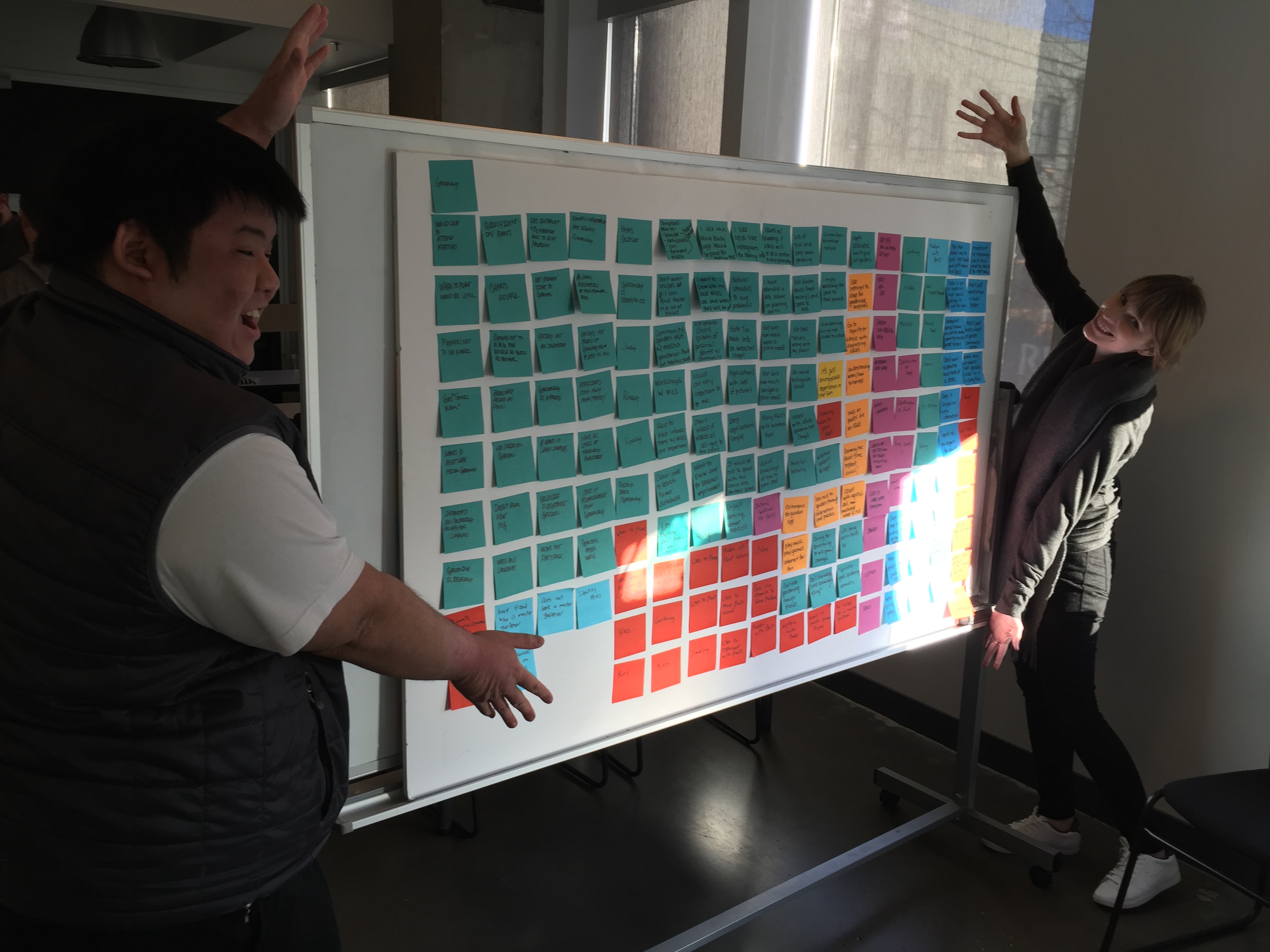
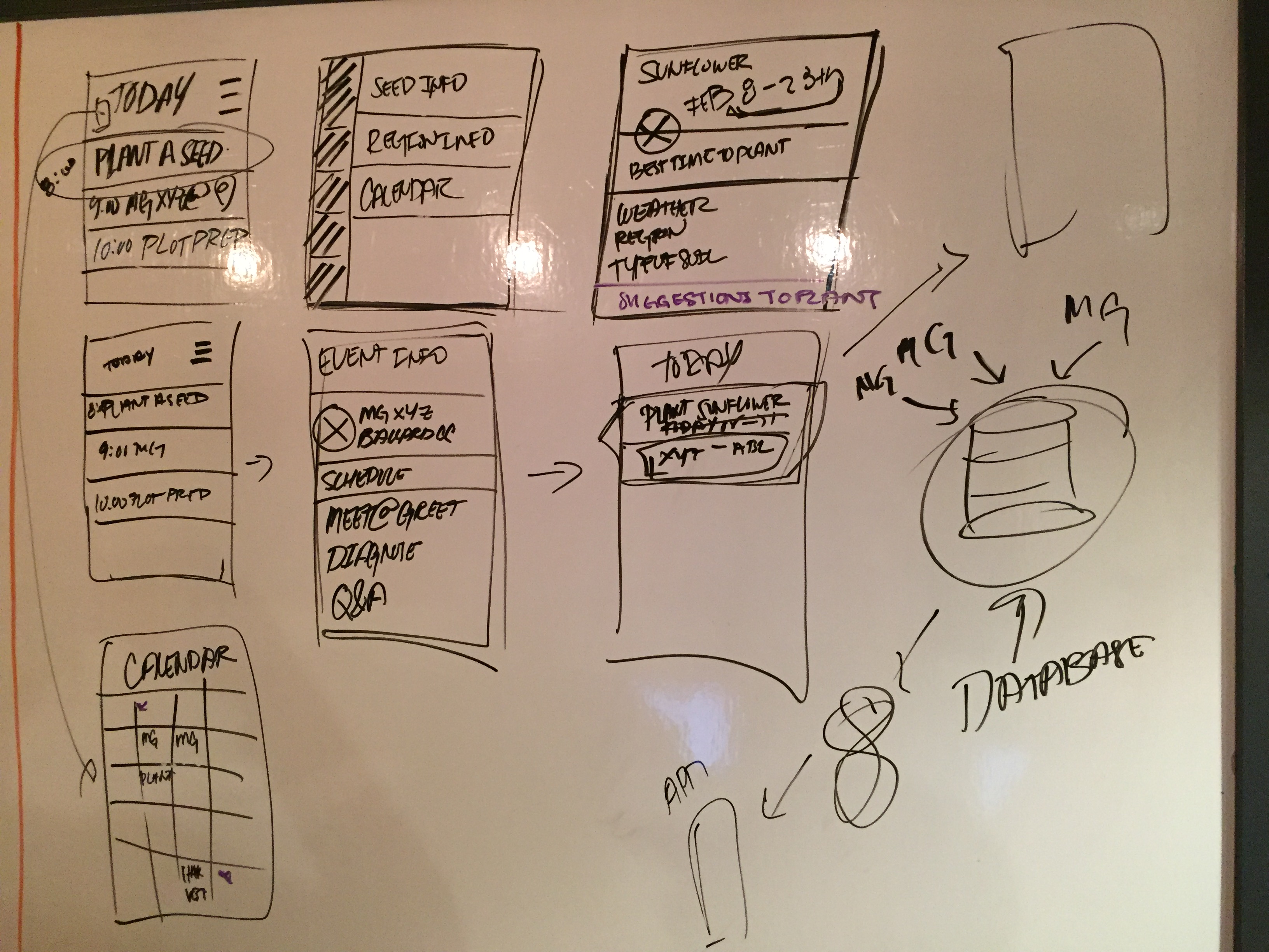
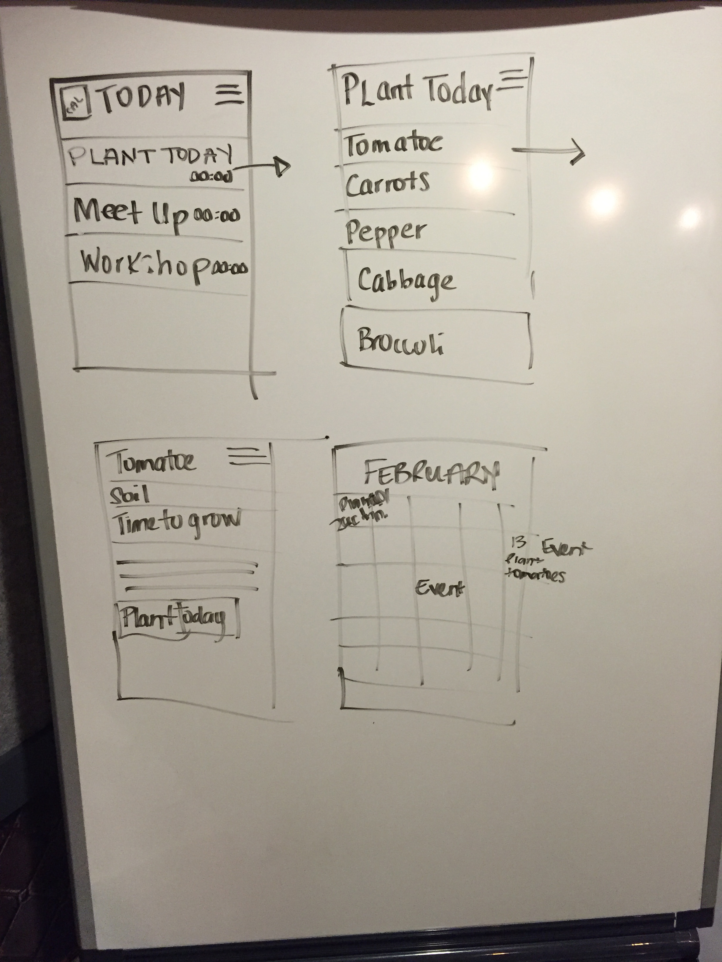
To begin our designs, we first developed a user flow and an application map. By doing this we were able to see how a typical user might go through the application and foresee any problems with the process. We also outlined some features that we wanted to make sure we touched upon. To do this, we made an affinity diagram and a concept map to better understand our users.
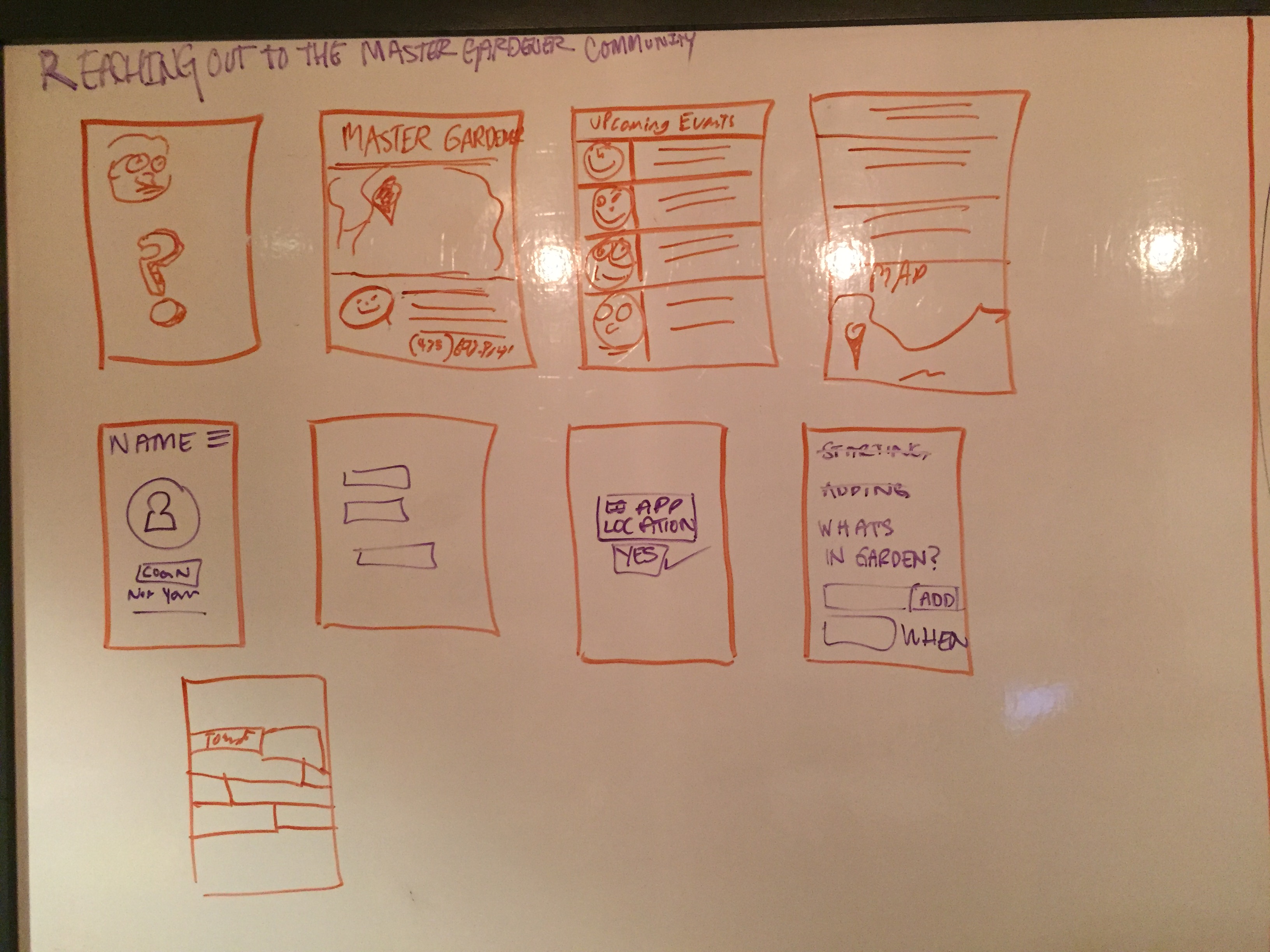
After organizing our data, we moved to the sketching phase. We wanted to explore different ideas, so we used design studio to showcase what we had in our minds.
Sketches

Hi-Fi/Prototype